| Statistics Toolbox | Search Help Desk |
| xbarplot | Examples See Also |
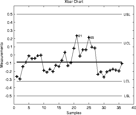
X-bar chart for Statistical Process Control.
Syntax
xbarplot(DATA)
xbarplot(DATA,conf)
xbarplot(DATA,conf,specs)
[outlier,h] = xbarplot(...)
Description
xbarplot(DATA) displays an x-bar chart of the grouped responses in DATA. The rows of DATA contain replicate observations taken at a given time. The rows must be in time order. The upper and lower control limits are a 99% confidence interval on a new observation from the process. So, roughly 99% of the plotted points should fall between the control limits. xbarplot(DATA,conf) allows control of the the confidence level of the upper and lower plotted confidence limits. For example, conf = 0.95 plots 95% confidence intervals. xbarplot(DATA,conf,specs) plots the specification limits in the two element vector,specs.
[outlier,h] = xbarplot(DATA,conf,specs) returns outlier, a vector of indices to the rows where the mean of DATA is out of control, and h, a vector of handles to the plotted lines.
Example
Plot an x-bar chart of measurements on newly machined parts, taken at one hour intervals for 36 hours. Each row of therunout matrix contains the measurements for four parts chosen at random. The values indicate, in thousandths of an inch, the amount the part radius differs from the target radius.
load parts
xbarplot(runout,0.999,[-0.5 0.5])
See Also
capaplot,histfit,ewmaplot,schart